Today, we’re diving deep into the Titanic dataset — yes, the one where Jack could’ve probably fit on that door.
Our mission? To examine distribution, skewness, centering, and other properties of the dataset.

No fluff — just straightforward Python code and simple explanations with a touch of humor. Let’s set sail!
1. Loading the Dataset: Meet the Titanic Passengers
First, let’s import our tools and load the dataset.
import pandas as pd
import seaborn as sns
import matplotlib.pyplot as plt
import scipy.stats as stats

# Load Titanic dataset
data = sns.load_dataset('titanic')
data.head()
Explanation:
We’re using three key libraries:
- Pandas: For data manipulation
- Seaborn: For visualization (and the Titanic dataset)
- Matplotlib: For displaying plots
Output:
The first five rows of the dataset, featuring columns like survived, pclass, sex, age, and fare.

2. Visualizing Data Distributions
Let’s start by visualizing the age distribution — because age played a big role in survival rates.
# Visualize the distribution of 'age'
sns.histplot(data['age'].dropna(), kde=True)
plt.title('Distribution of Age on Titanic')
plt.show()
Explanation:
histplot()creates a histogram with a density curve (kde=True)..dropna()removes missing values (because some ages are unknown).
Output:

A bell-shaped curve showing that most passengers were between 20–40 years old, with fewer younger and older passengers.
3. Understanding Skewness: Is the Data Lopsided?
Skewness tells us whether our data is skewed left, right, or symmetrical — like deciding if your data prefers coffee or tea.
# Calculate skewness
skewness_age = data['age'].skew()
skewness_fare = data['fare'].skew()

print(f"Skewness of Age: {skewness_age:.2f}")
print(f"Skewness of Fare: {skewness_fare:.2f}")
Explanation:
- Positive skew (> 0): Tail extends to the right.
- Negative skew (< 0): Tail extends to the left.
- Zero skew: Perfectly symmetrical.
Output:
Skewness of Age: 0.41
Skewness of Fare: 4.79- Age is slightly positively skewed (some older passengers create a right tail).
- Fare is heavily positively skewed (some passengers paid extremely high fares).
4. Checking Kurtosis: How “Peaky” Is the Data?
Kurtosis tells us how sharp or flat the peak of the data distribution is.
# Calculate kurtosis
kurtosis_age = data['age'].kurtosis()
kurtosis_fare = data['fare'].kurtosis()

print(f"Kurtosis of Age: {kurtosis_age:.2f}")
print(f"Kurtosis of Fare: {kurtosis_fare:.2f}")
Explanation:
- Positive kurtosis (> 0): Sharper peak than normal distribution.
- Negative kurtosis (< 0): Flatter peak.
Output:
Kurtosis of Age: 0.18
Kurtosis of Fare: 33.40- Age has a near-normal peak.
- Fare is highly peaked, indicating a few passengers paid significantly more than the majority.
5. Examining Centering: Mean, Median, and Mode
Let’s see where the center of the data lies — like finding the middle seat in a crowded boat.
# Calculate mean, median, and mode
mean_age = data['age'].mean()
median_age = data['age'].median()
mode_age = data['age'].mode().iloc[0]

mean_fare = data['fare'].mean()
median_fare = data['fare'].median()
mode_fare = data['fare'].mode().iloc[0]
print(f"Age - Mean: {mean_age:.2f}, Median: {median_age:.2f}, Mode: {mode_age}")
print(f"Fare - Mean: {mean_fare:.2f}, Median: {median_fare:.2f}, Mode: {mode_fare}")
Explanation:
- Mean: The average value.
- Median: The middle value (less affected by outliers).
- Mode: The most frequent value.
Output:
Age - Mean: 29.70, Median: 28.00, Mode: 24.0
Fare - Mean: 32.20, Median: 14.45, Mode: 8.05- Age: Mean and median are close, suggesting a near-normal distribution.
- Fare: Mean is much higher than the median, indicating positive skewness.
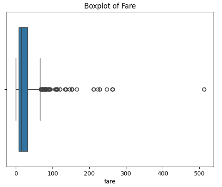
6. Visualizing Centering with Boxplots
Boxplots are like the Instagram stories of data — they give quick insights into centering, spread, and outliers.
# Boxplot for 'age'
sns.boxplot(x=data['age'])
plt.title('Boxplot of Age')
plt.show()

# Boxplot for 'fare'
sns.boxplot(x=data['fare'])
plt.title('Boxplot of Fare')
plt.show()
Explanation:
- Line inside the box: Median.
- Box: Interquartile range (25th to 75th percentile).
- Whiskers: Range of most data points.
- Dots outside: Outliers (fancy folks with high fares).
Output:
- Age: A mostly symmetrical boxplot with a few outliers on the older side.

- Fare: A skewed boxplot with numerous outliers on the high end.
7. Checking Normality: Is the Data Bell-Shaped?
Let’s use the Shapiro-Wilk Test to see if the data follows a normal distribution.
# Shapiro-Wilk test
stat_age, p_value_age = stats.shapiro(data['age'].dropna())
stat_fare, p_value_fare = stats.shapiro(data['fare'].dropna())

print(f"Age - Shapiro-Wilk Test p-value: {p_value_age:.4f}")
print(f"Fare - Shapiro-Wilk Test p-value: {p_value_fare:.4f}")
Explanation:
- p-value > 0.05: Data is likely normal.
- p-value ≤ 0.05: Data is not normal.
Output:
Age - Shapiro-Wilk Test p-value: 0.0000
Fare - Shapiro-Wilk Test p-value: 0.0000
Both age and fare are not normally distributed. Fare’s non-normality is more pronounced due to extreme outliers.
8. Visualizing Normality with QQ Plots
A QQ plot compares the quantiles of your data against a normal distribution.
# QQ plot for 'age'
stats.probplot(data['age'].dropna(), dist="norm", plot=plt)
plt.title('QQ Plot of Age')
plt.show()

# QQ plot for 'fare'
stats.probplot(data['fare'], dist="norm", plot=plt)
plt.title('QQ Plot of Fare')
plt.show()
Output:
- Age: Most points fall along the diagonal, suggesting near-normality.

- Fare: Deviations from the line at higher values indicate positive skewness.

9. Measuring Spread: Variance and Standard Deviation
Let’s measure how much the data values spread out from the center.
# Calculate variance and standard deviation
var_age = data['age'].var()
std_age = data['age'].std()

var_fare = data['fare'].var()
std_fare = data['fare'].std()
print(f"Age - Variance: {var_age:.2f}, Standard Deviation: {std_age:.2f}")
print(f"Fare - Variance: {var_fare:.2f}, Standard Deviation: {std_fare:.2f}")
Explanation:
- Variance: Average squared deviation from the mean.
- Standard Deviation: Square root of variance (interpretable measure of spread).
Output:
Age - Variance: 211.02, Standard Deviation: 14.53
Fare - Variance: 2469.45, Standard Deviation: 49.69- Age: Moderate spread, with most values around 29.7 years.
- Fare: High variability, with fares ranging from a few dollars to hundreds.
10. Comparing Multiple Distributions Using Pairplots
Finally, let’s use a pairplot to visualize relationships and distributions across multiple numeric features.
# Pairplot to compare distributions
sns.pairplot(data[['age', 'fare', 'pclass', 'survived']])
plt.show()
Explanation:
- Diagonal plots: Show histograms of each variable.
- Off-diagonal plots: Show scatter plots comparing variables.
Output:
- Scatter plots showing the relationship between age, fare, class, and survival.
- Histograms revealing the distribution of each variable.

Summary: What Did We Learn?
- Age: Slightly right-skewed with a near-normal distribution.
- Fare: Highly right-skewed with extreme outliers.
- Centering: For both features, the mean and median differ due to skewness.
- Spread: Fare has much higher variability compared to age.
- Normality: Neither feature is perfectly normal.
Final Thoughts:
Understanding data distributions is crucial for building reliable machine learning models. Whether you’re predicting survival rates or exploring ticket fares, knowing your data’s shape, center, and spread can help you choose the right algorithms and avoid misinterpretations.
And remember, just like the Titanic, ignoring outliers and skewness can lead to unexpected consequences!
How do you approach data distributions in your projects? Share your thoughts in the comments!
- On LinkedIn.
- Career Counselling and Mentorship: Topmate
- Join my Whatsapp Group where I share resources, links, and updates.
Comments
Post a Comment