Learn these technical concepts in a fun-filled story telling manner!
This is a story of Statistics and Davangers — a group of five friends who were equal parts data nerds and mischief-makers.
Today, they find themselves, once again, at their favorite café. The task for the day? To break down the ten most important statistical concepts every aspiring data scientist or statistician should know.
There was Arjun, the logical strategist, Sakshi, the visualization queen, Aarav, the self-proclaimed “smooth talker” (though most of his one-liners fell flat), Vikram, the financial analytics expert, and Ananya, the stats genius who kept them all grounded.
As usual, Aarav began with his signature charm, directed at Sakshi. “Sakshi, you must be a statistic because you make my heart follow a normal distribution.”
Sakshi rolled her eyes. “That line has a negative skew, Aarav.”
But the gang wasn’t here for just banter; they had some serious learning to do.
1. Descriptive Statistics: Understanding the Basics
Ananya took charge. “Descriptive statistics is the foundation. It’s all about summarizing your data.
You’ve got measures of central tendency — like mean, median, and mode — and measures of variability — like variance, range, and standard deviation. These metrics help you understand your dataset at a glance.”
- Mean: The average value.

- Median: The middle value in a sorted dataset.
- Mode: The most frequently occurring value.
- Variance: How spread out the data is.
- Standard Deviation: The square root of variance.

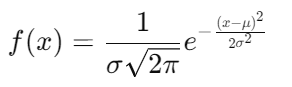
2. Probability Distribution: From Coin Tosses to Complex Predictions
Vikram, always into financial risk, jumped in. “Probability distributions show how data is spread. For example, if you’re tossing a coin, you’re using a binomial distribution. But if you’re tracking stock prices or the heights of people, you’ll likely use the normal distribution.”
- Normal Distribution: A symmetric bell curve where the mean (μ) is at the center, and standard deviation (σ) controls the spread.
- Binomial Distribution: Used for binary outcomes (success/failure). For n trials and probability of success as p, the formula is:

Example:
If you flip a coin 10 times with a probability of heads p=0.5, the probability of getting exactly 5 heads is:

3. Correlation and Covariance: Measuring Relationships
Sakshi started talking about how variables relate to one another.
“Correlation tells you how two variables move together, while covariance tells you if they vary in the same direction.”
- Correlation: A standardized measure of the relationship between two variables. It ranges from -1 to 1.
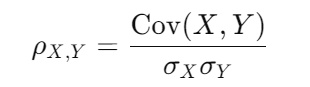
- Covariance: The degree to which two variables change together. Positive covariance means they move in the same direction.

Example: If you want to see if there’s a correlation between hours studied and test scores, you’d calculate the covariance and correlation.
Aarav, leaning toward Sakshi, said, “Our correlation must be close to a perfect 1, don’t you think?”
Sakshi replied, “I think it’s more like -1, we move in opposite directions.”
4. Central Limit Theorem: The Backbone of Statistical Inference
Arjun, ever the serious one, took over. “The Central Limit Theorem (CLT) is crucial. It states that the distribution of sample means approaches a normal distribution as the sample size becomes large, regardless of the population’s distribution.”
5. Hypothesis Testing: The Scientific Method for Data
Ananya was in her element. “In hypothesis testing, you start with two hypotheses: the null hypothesis (H₀) and the alternative hypothesis (H₁). Then, you collect data and decide whether to reject H₀.”
- Null Hypothesis (H₀): There’s no effect or difference.
- Alternative Hypothesis (H₁): There’s an effect or difference.
Test Statistic:
For a Z-test (when σ is known), the formula is:

Example:
Say you want to test if the average salary of data scientists is $100,000. You sample 50 data scientists and find a mean salary of $102,000 with a standard deviation of $10,000.

Aarav, trying again, said, “So, if I test my hypothesis that you secretly like me, would I get a significant result?” Sakshi deadpanned, “That’s a null hypothesis you can never reject.”
6. P-Values: The Key to Hypothesis Testing
Vikram explained further, “The p-value tells you how likely it is that your results happened by chance. If your p-value is less than a threshold (usually 0.05), you reject the null hypothesis.”
- P-value: If p<0.05, reject H₀. If p≥0.05, fail to reject H₀.
Example:
For a p-value of 0.03, you’d reject the null hypothesis at a 5% significance level.
7. Confidence Intervals: Estimating Parameters with Confidence
Sakshi explained, “A confidence interval gives a range of values within which you expect the population parameter to fall. A 95% confidence interval means you’re 95% sure the true value lies within the range.”
Formula for a Confidence Interval:

Example:
If your sample mean is 100,000, and your Z-value for 95% confidence is 1.96, with σ=10,000 and n=50, the confidence interval is:

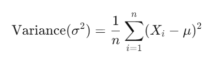
8. Variance and Standard Deviation: Measuring Spread in Data
Ananya stepped back in. “Variance measures how spread out the data points are, and standard deviation is just the square root of that.”
- Variance:

- Standard Deviation:

Aarav, trying to join the conversation, said, “So the variance in how much Sakshi laughs at my jokes must be huge!”
Sakshi, without missing a beat, replied, “No, Aarav, the standard deviation is zero because I never laugh at them.”
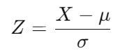
9. Z-Scores and T-Scores: Understanding Where Your Data Stands
Arjun continued, “Z-scores and T-scores are used to standardize your data, making it easier to compare across different datasets.
Z-scores are used when the population standard deviation is known, and T-scores are for when it’s unknown and the sample size is small.”
- Z-score formula:
- T-score formula:

Where X is the sample mean, μ is the population mean, σ is the population standard deviation, and s is the sample standard deviation.
Example:
Say the average salary of data scientists is $100,000, and your data point is a salary of $110,000, with a standard deviation of $10,000. The Z-score would be:

This means the salary is 1 standard deviation above the mean.
10. ANOVA: Comparing Multiple Groups
Ananya wrapped things up. “ANOVA, or Analysis of Variance, is used to compare means across multiple groups. It tests if there are significant differences between the means of different groups.”
Formula for ANOVA:
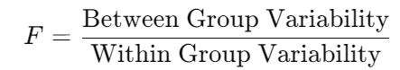
Where:
- Between Group Variability measures how much the group means differ from the overall mean.
- Within Group Variability measures how much the data points within each group differ from their group mean.
Example:
Suppose you want to test if the average salaries in three different cities are significantly different. ANOVA will help you determine whether the differences in means are due to random variation or actual differences between the cities.
Aarav, still not giving up, said, “So if we run an ANOVA on how much everyone likes me, I’d stand out, right?”
Sakshi laughed, “You’d stand out, but only as the outlier.”
Wrapping Up: The Stats Adventure Continues
The Davangers laughed and joked through their conversation, but by the end, they had covered some of the most essential statistical concepts every aspiring data scientist should know. Whether it was Aarav’s cheesy pick-up lines or Sakshi’s quick retorts, the group learned a lot while keeping the mood light.
Arjun, always the leader, summed it up. “Mastering these concepts is like building the foundation for a house. Once you understand them, you can start building more complex models and really make an impact with your data science skills.”
The Davangers were ready for their next challenge. And with their mix of knowledge, humor, and camaraderie, they were unstoppable.
Thanks for joining the journey! This was a new attempt to explain technical statistical concepts in a fun-story setting. Hope you enjoyed the journey.
- On LinkedIn.
- Career Counselling and Mentorship: Topmate
- Join my Whatsapp Group where I share resources, links, and updates.
Comments
Post a Comment