Simple Explanations and Code Walkthroughs in Plain English
Ready to turn raw data into insightful stories? Whether you’re new to Python or a seasoned pro looking to sharpen your skills, this guide will show you how to master descriptive statistics in Python. Let’s dive into the numbers and uncover the hidden patterns that drive credit risk — because data exploration has never been this fun.

What is Descriptive Statistics?
Before we get our hands dirty with code, let’s understand what descriptive statistics actually are.
In a nutshell, descriptive statistics refers to the measures and tools used to summarize and understand the essential features of your data. They’re super critical in performing descriptive and diagnostic analytics, and they help you get acquainted with your data before you dive into more complex analysis.
The key concepts we’ll cover include:
- Measures of Central Tendency
- Measures of Dispersion
- Data Distributions
- Correlation
Let’s get started, or should I say, let’s roll up our sleeves and jump into the Python side of things!
Step 1: Import Necessary Libraries and Load the Data
First things first, we need our trusty Python libraries. Think of them as the tools in your statistical toolkit. We’ll be using `pandas` for data wrangling and `numpy` for some mathematical magic. You can download the data here.
# Load libraries
import pandas as pd
import numpy as np
# Load data
loans_data = pd.read_csv('loansdata.csv')
# Display the first few rows
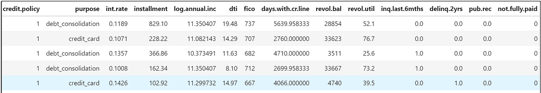
loans_data.head()Output:
Step 2: Understand the Data
The original data used in this exercise comes from publicly available data from LendingClub.com, a website that connects borrowers and investors over the Internet.
Let’s get more information on the data.
loans_data.info()Output:

So there are 14 variables used in the data, and a brief data dictionary is provided below:

Step 3: Summary Statistics for Numerical Data
Time to get cozy with your data! Let’s start with the measures of central tendency— the mean, median, and mode.
Mean gives you the average, median tells you the middle value, and mode shows the most frequent value. These help you figure out where most of your data points are hanging out.
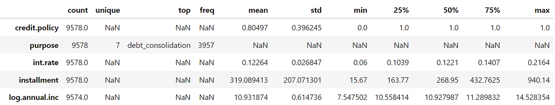
In Python, the describe() function provides the important summary statistics for the numerical variables.
# Summary statistics for numerical columns
loans_data.describe().transpose()
Output:

You can see some of the important statistical values such as count, min, mean, median, max, the first (25%), and the third (75%) quartile, etc represented in the output above. Note that the 50% value below refers to the median for the corresponding variable.
Step 4: Summary Statistics including Categorical Data
The describe() function only provides the summary statistics for the numerical variables. However, you can add categorical variables by simply adding the include='all' arguments to the function as shown below.
loans_data.describe(include='all').transpose()Output:
You can see the output now contains details for the purpose variable, which has seven unique values, and debt_consolidation has the highest frequency (mode). We can confirm this with the code below:
import matplotlib.pyplot as plt

# Calculate the value counts for the 'purpose' column
purpose_counts = loans_data['purpose'].value_counts()

# Creating a bar plot for the loan purposes
plt.figure(figsize=(8, 4))
purpose_counts.plot(kind='bar', color='skyblue')
plt.title('Distribution of Loan Purposes')
plt.xlabel('Purpose')
plt.ylabel('Number of Loans')
plt.xticks(rotation=45, ha='right')  # Rotate x labels for better readability
plt.show()
Output:

Step 5: Identifying and Handling Missing Values
Missing data is like finding a hole in your favorite socks — annoying but fixable. We’ll either fill in those gaps or toss out the problem areas altogether. This is one of the key data exploration tasks during descriptive analytics, and it’s quite easy to figure this out in Python.
loans_data.isnull().sum()Output:

The output above shows there are missing values in the data. There are various techniques to handle missing values, and it can be a complete tutorial in itself, which is not the focus here (will cover it in future!).
Step 6: Distribution Analysis (Measures of Dispersion)
Now, let’s talk about measures of dispersion — that basically represents how spread out is your data? Are most values huddling together, or are they all over the place?
We’ll use histograms, boxplots, and calculate the range, variance, standard deviation, and interquartile range (IQR) to quantify this.
Range
The range gives you the difference between the maximum and minimum values. It’s a quick way to see the span of your data. One example to calculate range for a variable is shown below.
# Calculate the range for 'int.rate'
int_rate_range = loans_data['int.rate'].max() - loans_data['int.rate'].min()
print(f"Range of Interest Rate: {int_rate_range}")
Output:
Range of Interest Rate: 0.1564Variance and Standard Deviation
Variance tells you how much the data is spread out from the mean, while standard deviation gives you that spread in the same units as your data. If your standard deviation is high, your data likes to party all over the place!
You can use the var() or the std() functions to compute these for any numerical variable.
# Calculate the variance and standard deviation for 'int.rate'
int_rate_variance = loans_data['int.rate'].var()
int_rate_std_dev = loans_data['int.rate'].std()

print(f"Variance of Interest Rate: {int_rate_variance}")
print(f"Standard Deviation of Interest Rate: {int_rate_std_dev}")
Output:
Variance of Interest Rate: 0.0007207607224355354
Standard Deviation of Interest Rate: 0.026846987213382724
Interquartile Range (IQR)
The IQR is the range between the 75th percentile (Q3) and the 25th percentile (Q1). It gives you an idea of where the central 50% of your data lies.
# Calculate the IQR for 'int.rate'
Q1 = loans_data['int.rate'].quantile(0.25)
Q3 = loans_data['int.rate'].quantile(0.75)
IQR = Q3 - Q1
print(f"IQR of Interest Rate: {IQR}")
Output:
IQR of Interest Rate: 0.036799999999999986Visualizing with Histograms and Boxplots
Visualizations transform numbers into narratives, making complex data easily digestible.
Let’s use histograms and boxplots to see how our data is distributed and where those outliers might be hiding.
Couple of examples — histogram of the interest rate variable, and boxplot of the Debt-to-Income ratio — are given below.
# Histogram of the interest rate
loans_data['int.rate'].hist(bins=30)
plt.title('Distribution of Interest Rate')
plt.xlabel('Interest Rate')
plt.ylabel('Frequency')
plt.show()
Output:

# Boxplot of the Debt-to-Income ratio
loans_data.boxplot(column='dti')
plt.title('Boxplot of Debt-to-Income Ratio')
plt.ylabel('Debt-to-Income Ratio')
plt.show()
Output:

Step 7: Correlation Analysis
Next in line is the correlation analysis. Let’s see who’s friends with whom! Correlation tells us how different variables are linked. Are they walking hand-in-hand, or are they giving each other the cold shoulder?
# Select only numerical columns for correlation analysis
numerical_data = loans_data.select_dtypes(include=[np.number])

# Calculate the correlation matrix
correlation_matrix = numerical_data.corr()

# Visualization of the correlation matrix using a heatmap
import seaborn as sns
import matplotlib.pyplot as plt

plt.figure(figsize=(10, 8))
sns.heatmap(correlation_matrix, annot=True, cmap='coolwarm')
plt.title('Correlation Matrix')
plt.show()
Output:

Interpretation: A correlation of +1 means they’re besties (high positive correlation), 0 means they’re strangers (no correlation), and -1 means they’re frenemies (high negative correlation).
Step 8: Skewness
For those who want to get fancy, skewness is something that’s an important statistic to consider. It’s an enemy of normal distribution, which is often the distribution required to carry out many statistical tests/ hypothesis. It’s easy to calculate skewness using the skew() function.
# Select only numerical columns for skewness and kurtosis analysis
numerical_data = loans_data.select_dtypes(include=[np.number])

# Compute skewness for numerical columns
skewness = numerical_data.skew()
print(f"Skewness:\n{skewness}\n")
Output:

The thumb rule with skewness is that if its values lies between -1 and 1, the distribution can be considered to be normal. For anything beyond these values, its a skewed distribution.
Conclusion
There you have it — a whirlwind tour of descriptive statistics in Python! By the end of this journey, you should feel like you’ve got a good handle on your data’s central tendencies, dispersions, distributions, and relationships. Now go forth and impress your data with your newfound statistical prowess!
Hope you liked this tutorial and found it useful. I have also written an another article on Credit Risk Modeling using Python, which you might check out.
📘 Want to Learn How to Answer the Way Interviewers Expect?
I wrote Machine Learning Interview Mastery to help candidates understand how interviewers think and how to respond with structure and confidence.
If this article resonated, you may find the book helpful:
👉 https://decisionscientist.gumroad.com/l/jpxnsg
Connect with me:
- On LinkedIn.
- Career Counselling and Mentorship: Topmate
- Join my Whatsapp Group where I share resources, links, and updates.
Comments
Post a Comment